
Nobel laureate Paul Romer’s model shows that if we use a test to determine who gets put into isolation, the fraction of the population that needs to be confined and isolated will be dramatically smaller. These benefits are available even with an imperfect test and without any contact tracing. It does take frequent testing, however, with each person getting re-tested roughly every two weeks.

To understand the effects that more testing could have on the course of the pandemic, I constructed a simple model that I could use to simulate and visualize the effects of different policies. This post, the first in a series, introduces the model.
In the second part of the post, I’ll use the model to compare the effects of a policy of nonspecific or uniform social distancing with those from a targeted policy that uses tests to make sure that someone who is infectious is more likely to be quarantined.
This is not the type of model one can use to capture the actual course of the disease. For that purpose, only a fully-fledged model of the type developed by epidemiologists will suffice. Instead, it is a toy model that allows a visualization that helps explain how the more complicated models work. That said, it also has enough structure to offer some insight into two relevant questions that we should be asking:
1. How much difference does it make to the outcome if the test used to decide who gets isolated has a higher false-negative rate? Answer: Very little.
2. If we contrast a nonspecific policy of social distance with a targeted policy guided by frequent testing that is equally effective at containing the virus, how much more disruptive is the nonspecific policy? Answer: Way more disruptive.
The model can be represented by the three types of symbols that move around in a box:
- Blue inverted triangles, which are vulnerable to catching the virus.
- Red circles, which are infectious.
- Purple squares, which were infectious before but have recovered and now can neither catch nor transmit the virus.
Here are the main rules behind the simulation:
1. The symbols move around at random.
2. The probability that a vulnerable triangle is infected by a red circle goes up when they get sufficiently close.
3. After a random period of time, a red dot recovers and turns into a purple triangle.
4. To simplify the dynamics, I assume that all red dots recover and that none of them die.
Adding a realistic death rate—something on the order of 1 percent of the red dots—will have little effect on the dynamics of the model. When it comes time to assess different policies, it will be enough to know that deaths will be proportional to the cumulative number of people who are infected.
Visualizing One Run of the Model
The run of the model illustrated here has 200 symbols, 5 of which are selected at random and assumed to be infectious:
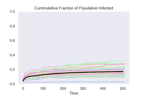
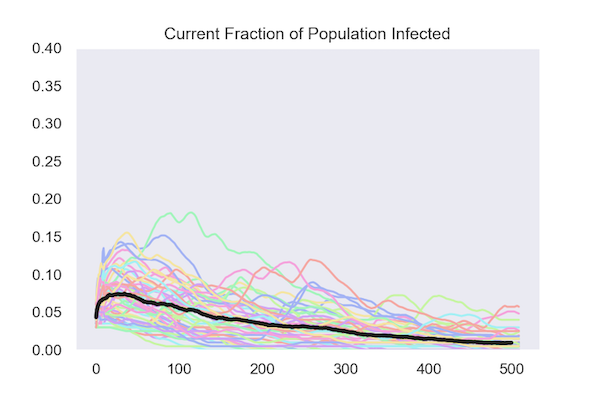
Summary Data from 50 Runs of the Model
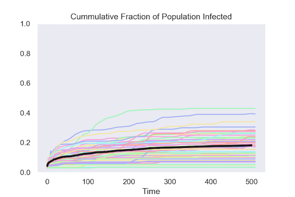
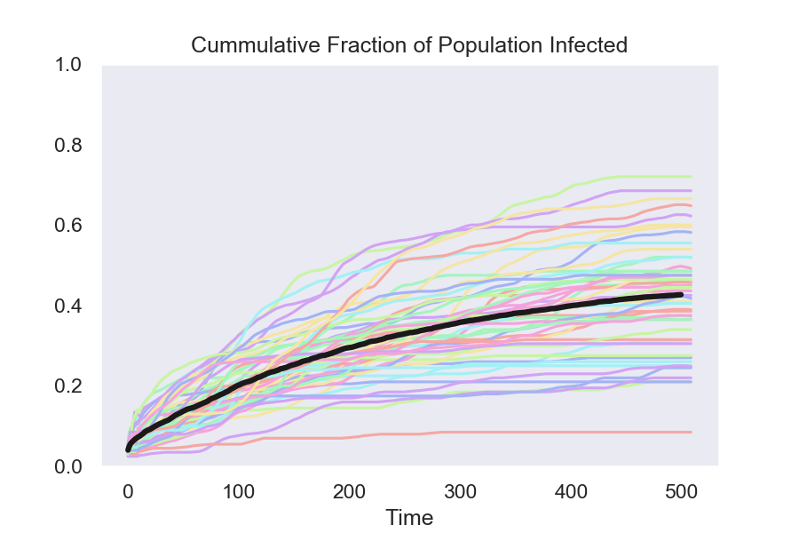
One way to summarize a run of model is to track the cumulative fraction of the population that has been infected by the virus. The first figure shows how this evolves in 50 runs of the model. The black line is the average at each date over these 50 runs.

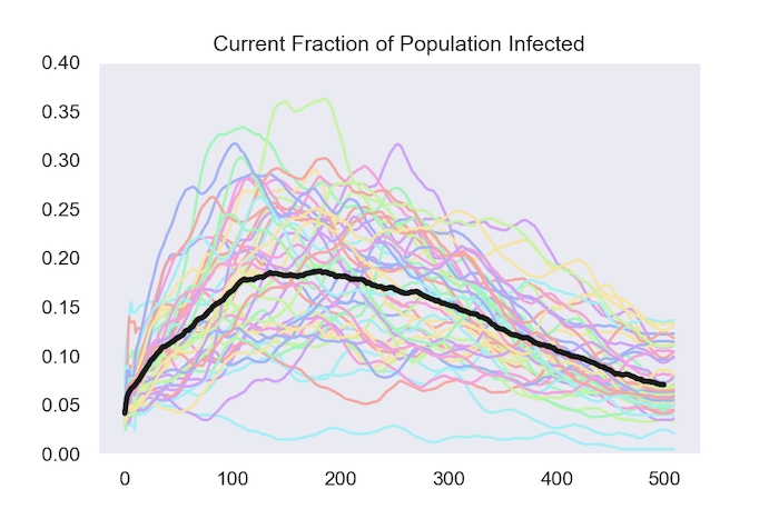
The other way to track what happens is by following the fraction of the population that is infected at each date. The next figure does this for the same 50 runs and once again shows the average in black.
So far, all the model does is replicate a few of the basic features of more realistic models that epidemiologists work with. The more interesting part comes in the next part of this post, where I use the model to answer the two questions highlighted in the beginning:
1. How much disruption can testing avoid?
2. How much does it matter if the tests are inaccurate?
In the first part, I presented a “dots in a box” model of the spread of a virus. Here, I use it to compare the economic and social cost of two policies that are equally effective at containing the virus.
What the simulations show is that if we use a test to determine who gets put into isolation the fraction of the population that needs to be confined and isolated is dramatically smaller.
These benefits are available even with an imperfect test and without doing any contact tracing. It does take frequent testing, with each person getting retested roughly every two weeks.
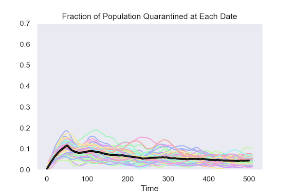
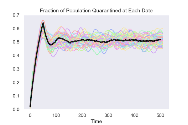
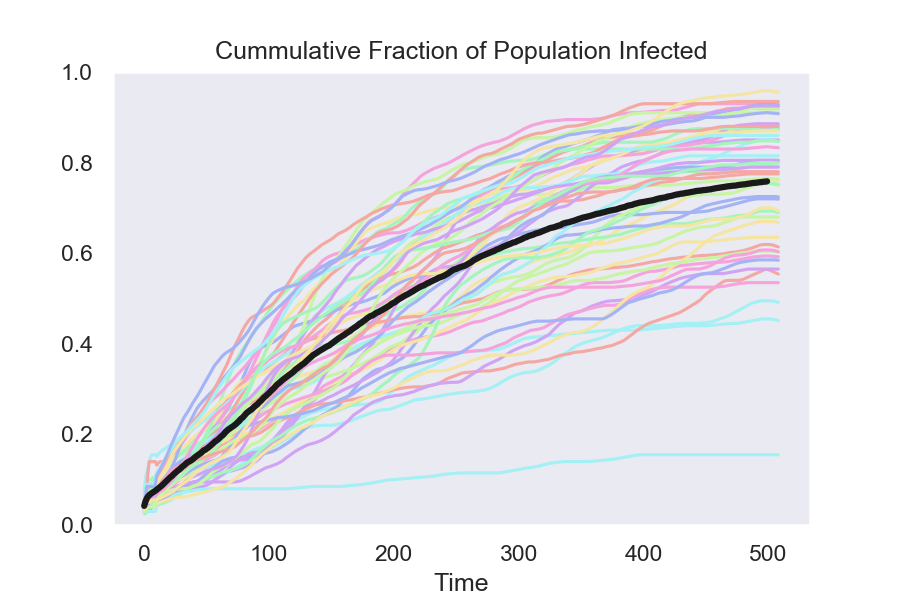
Here are two plots that show the key result from the simulations. Each colored line represents one run from the 50 simulations. The black lines show the average across all 50.
Isolating based on test results:
Isolating at random:
This comparison shows that isolation based on test results requires much less disruption to normal patterns of social interaction.
An economy can survive with 10 percent of the population in insolation. It can’t survive when 50 percent of the population is in isolation.
It is not hard to see why targeting the isolation based on test results reduces the total number of people in isolation. What matters for controlling the infection is how many infectious people it isolates.
If people are isolated at random, you have to isolate a lot more to get the same number of people who are infectious.
Details
As before, the model has three types of markers that move around in a box:
- Blue inverted triangles, who are vulnerable to catching the virus.
- Red circles, who are infectious.
- Purple squares, who were infectious before but have recovered and now can neither catch nor transmit the virus.
To illustrate the effect of isolation, the model introduces a fourth symbol—a hollow orange box. Individuals that have been put in a box can’t move. Other individuals can’t get close because they “bounce” off its walls.
After some time has elapsed, the box goes away and the individual is once more free to move around and interact with others. The only difference between the two policies is how dots are selected for isolation.
Under the frequent testing policy, 7 percent of the population is randomly selected for testing each day. Over the 500 days illustrated in the plots and the animation, this means that the average person is tested about 30 times in 500 days—roughly once every two weeks.
Those that test positive are isolated. Because the test generates both false positives, some vulnerable individuals (blue inverted triangles) and some immune individuals (purple squares) are put in a box. (The test is far from perfect. I assume a 20 percent false-negative rate and a 1 percent false-positive rate.)
Under the random isolation policy, a fixed fraction of the population is randomly selected for isolation each day. I found the number that needed to be isolated by starting with a low value and increasing it until the random policy is on average, as effective at containing the spread of the virus as the targeted policy that relies on the tests.
Animations
It is easier to see the details of the model if you watch each of the videos separately in full-screen mode.
Isolating based on test results:
Isolating at random:
There are two obvious differences between these animations. Under the targeted policy that uses a test to decide who gets put into quarantine:
- A larger fraction of the individuals in isolation are the infectious ones signaled by the red dot.
- Much fewer people are isolated.
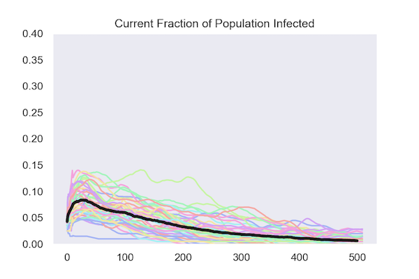
Simulated Data for 50 Runs of Each Model
Both policies keep the cumulative fraction of the population that is infected below 20 percent.
Isolating based on test results:
Isolating at random:
Under both policies, the fraction of the population that is infected (known as the attack rate) peaks early and declines, in most runs reaching zero.
Isolating based on test results:
Isolating at random:
Technical Notes:
1. This toy model is NOT CALIBRATED to real data. All the numbers and results are indicative, not predictive about the true behavior of the spread of the virus.
You should not take any number that emerges from the model as being something you can rely on. What the model does allow is a qualitative comparison of different policies. Moreover, the animation which shows the state of the model at each date or time slice, may help some people develop some intuition about common features in this class of models.
2. With those caveats, here are some of the specifics. Under the targeted policy, a random selection of about 7 percent of the population is tested each day. The test has a 20 percent false-negative rate; i.e. 20 percent of the people who are actually infectious will get a negative test result. This can arise because of bad swab or a very low level of virus in the early stage of infection. The test is also assumed to have a 1 percent false-positive rate; that is, 1 percent of people who are not infectious will nevertheless test positive. Although 7 percent of the population is tested each day, a small fraction test positive and goes into quarantine.
3. Under the random isolation policy, a random selection from the population is assigned to isolation each day. They stay in isolation for a fixed length of time. To achieve the same goal—a cumulative infection rate of less than 20 percent—this random isolation policy has to put a lot more people into quarantine, 3 percent of the population each day. I found this 3 percent rate by increasing it until the random isolation policy succeeded in keeping the cumulative infection rate under the same value, 20 percent, that the targeted policy that bases isolation on test results achieves. Given the time that someone has to spend in isolation, this means an average isolation rate in the population of about 50 percent.
4. I will make the Python behind these simulations available in a Jupyter notebook as soon as I have a chance to clean it up and document it.
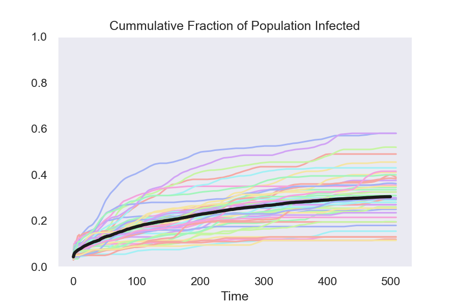
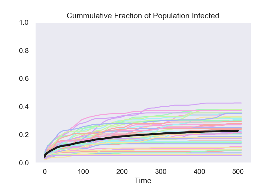
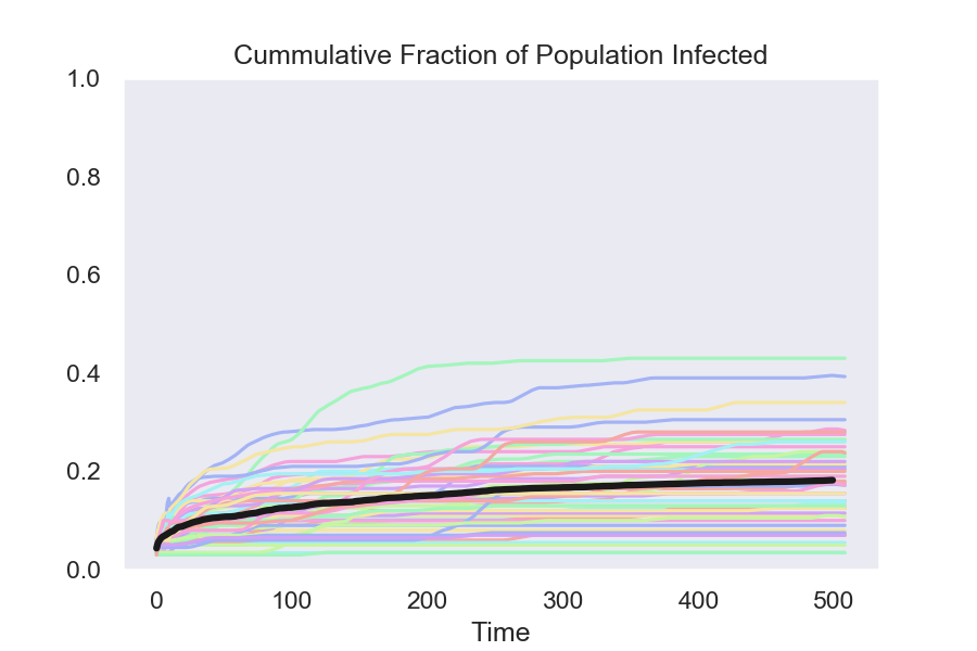
The simulated data here contrast policies that isolate people who test positive using four different assumptions about the quality of the test.
Even a very bad test cuts the fraction of the population who are ultimately infected almost in half. And when I say bad, I mean bad—an 80 percent false-negative rate, which means that 4 out of 5 of people who are truly infectious will get a negative test result—i.e. a result saying that they are not infectious.
From bad to better, results show:
1. The baseline with no testing, no isolation
2. A test with an 80 percent false-negative rate
3. A test with a 60 percent false-negative rate
4. A test with a 40 percent false-negative rate
5. A test with a 20 percent false-negative rate
Isolate using a test with 80 percent test false negatives
Isolate using a test with 60 percent false negatives
Isolate using a test with 40 percent false negatives
Isolate using a test with 20 percent false negatives
Details:
The colored lines in the graphs show the results from 50 runs of the model. The black line is the average at each date of these 50 runs.
The final result, with a 20 percent false-negative rate, is the one that I used in my previous post.
In the four cases with testing, I hold constant the fraction of the population that gets tested each day. (Increasing this fraction would be one way to compensate for a bad test.)
As a result, a simulation with a higher false-negative rate will put fewer people who are infectious into quarantine.
It shouldn’t really come as a surprise, but any policy that puts people who are infectious into quarantine will slow the spread of the disease.
Paul Romer, an economist and policy entrepreneur, is a co-recipient of the 2018 Nobel Prize in Economics and a Sciences and University Professor of Economics at NYU. This article was originally posted on his website.
ProMarket is dedicated to discussing how competition tends to be subverted by special interests. The posts represent the opinions of their writers, not necessarily those of the University of Chicago, the Booth School of Business, or its faculty. For more information, please visit ProMarket Blog Policy.