Narratives are vectors of ideas. Nobel laureate Robert Shiller suggests that in the age of social information networks, economists need to rethink how and why information really spreads.
In his recent 2017 American Economic Association (AEA) Presidential address, Nobel laureate Robert Shiller pointed out an interesting disconnect between economists and the real world. Of the thousands of papers in economics presented at the AEA’s conference in Chicago, not one mentioned the words “meme” or “viral.” In our digital society, memes compete in a crowded space and some go viral. Should researchers study these viral memes?
How does information spread?
The standard economic models think of information as being transmitted through dry facts. But how do we as humans judge a piece of information? Economists often assume that rational agents search for the most accurate descriptions of the world, so as to maximize their utility. However, Professor Shiller points out that information is more than just facts. They are packaged as stories. In his address, he focused on the concept of narratives. Narratives are simple stories that we tell to ourselves and to others to explain the world. These narratives are stimulating and easy to understand, remember, and share. So, they go viral, as people want to share them at cocktail parties and on social media.
A powerful narrative that went viral on social media a few years ago was of a teacher who failed an entire class full of socialists: because nobody worked hard, as the teacher said, everyone got the same average grade (see Figure 1). The narrative obviously simplifies the notion of equality and socialism, by conflating the notions of equality of opportunity and outcome. However, in its simplicity, the story becomes rhetorically persuasive and easily shareable. Another classroom-based narrative that went viral (with 1 million views on Buzzfeed), explained the idea of privilege (inequality of opportunity). In this story, a teacher made children aim a crumpled piece of paper at a bin at the front of the class; some children sat at the front while others sat behind.

Do economists understand what makes some stories so contagious? It is not difficult to see how the simplicity of the classroom narratives makes them far more accessible than a theoretically complicated book on equality. A complicated story has fewer takers than simpler ones do. But does it matter if the masses don’t understand the finer nuances of economics as long as their trusted representatives do?
Some economists would like to believe that policymakers who are more educated (and probably graduates in law or economics) understand the nuances of economics better. However, the economics profession itself doesn’t seem to be immune to fads. Shiller, in his address, drew insights from a 90-year-old epidemiology model from Kermack-McKendrick (1927) and showed how infections (or narratives) follow a hump-shaped curve.
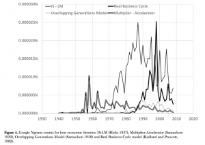
Shiller, using Google Ngrams, showed that prominent economic models like IS-LM or Multiplier Accelerator (see Figure 2) also follow a similar hump-shaped pattern of viral growth, peaking, and eventual decline. The difference between the spread in the Multiplier-Accelerator and IS-LM models is particularly interesting. The IS-LM model was proposed by John Hicks in 1937, before the Multiplier-Accelerator model by Paul Samuelson in 1939. Yet the Multiplier-Accelerator model peaked much earlier (around the 1960s) than the IS-LM model (around the 1980s), and declined sooner too. If economists are scientists and superior economic theories replace older ones, what explains this discrepancy?
The crux of Shiller’s address was that, if economists wish to understand information transmission better, especially in the era of social networks, they need to update their toolkits with the following:
- Models that study the contagion of evolving narratives (one example is Joel Mokyr’s approach of “market of ideas” with roles played by cultural entrepreneurs)
- Better methods of content analysis (one example is Deirdre McCloskey’s study of Bourgeois Values in her recent trilogy of books).
Why are some narratives so contagious?
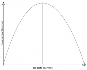
A difficult question that remains a black box for academia is “Why are some narratives more contagious than others?” To understand some of these causes, Shiller pointed at the Laffer Curve. The Laffer Curve (Figure 3) in economics is an inverted U-shaped relationship between tax rate and government revenue. The relationship implies that as tax rate increases, government revenue increases, but excessive taxation reduces revenue as it reduces incentive for work. (At 100 percent taxation nobody works and pays taxes!)
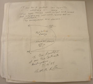
The curve’s origins can be traced at least as far back as 14th century Arab historian Ibn Khaldun. However, the curve was named after economist Arthur Laffer, who reportedly drew the curve on a napkin at a dinner in 1974 that i
ncluded Republican politicians Dick Cheney, Donald Rumsfeld, and Jude Wanniski of the Wall Street Journal. Jude Wanniski later colorfully retold this story in National Interest in 1978. He famously began his article with “As Arthur Laffer has noted, ‘There are always two tax rates that yield the same revenues,’” and used it as a rhetorical tool to argue that citizens know when they “are unnecessarily perched along the upper edge of the ‘Laffer curve’” and they “will support political leaders who can bring them back down.” What is noteworthy about this story is that Wanniski did not provide statistical support to back his claim that the country was indeed “perched along the upper edge of the Laffer curve.”
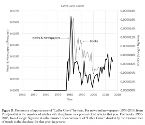
Yet, despite a lack of statistical backing, there was an explosion in popularity of the Laffer Curve after the publication of Wanniski’s article in 1978. In his AEA address, Shiller pointed out that the contagion of the Laffer Curve (see Figure 5) peaked around the early 1980s. Why the early 1980s? He noted: “The Laffer Curve owes much of its contagion to the fact that it was seen as justifying major tax cuts. The Laffer Curve’s contagion related to fundamental political changes associated with Ronald Reagan’s election as U.S. president in 1980 with his commitment to cutting taxes.”
One way to think of narratives is that they are vectors of ideas. Just as the success of a disease like malaria depends on the success of its vector—mosquitos—ideas are only as good as their narratives. If cutting taxes was the idea that tax cut proponents wanted to share, then the Laffer Curve became the vector that propagated this idea effectively during the election year. The curve was simple and yet academic, and was backed by an interesting story that involved a paper napkin, a curve, an economist, and few Republican politicians. It was memorable and shareable, highlighted by prominent publications and special interest groups.
Did the Laffer Curve narrative have an impact? Shiller noted:
“The Laffer Curve epidemic was followed during the Reagan presidency (1981-89) by a reduction in the top U.S. federal income tax bracket from 70 percent to 28 percent. The top-bracket U.S. corporate profits tax rate was cut from 46 percent to 34 percent during the Reagan administration. The top U.S. capital gains tax rate was reduced from 28 percent to 20 percent in 1981 (though raised back to 28 percent again in 1987 during the Reagan presidency). If the Laffer Curve epidemic had even a minor effect on these changes, it must have had tremendous impact on measures of output and prices.”
Just like in 1980, the 2016 elections presented us with newer narratives. President Donald Trump’s core narrative of “Make America Great Again” may have been lacking in details, but it was rhetorically persuasive. Similarly, if immigration restriction was the idea that President Trump wanted to share, then the slogan “Build the Wall” became an effective vector.
The “wall” promised a simple solution to many tough problems and provided the psychological safety of secure borders. It also matched some of President Trump’s other ideas, like protectionism and higher tariffs, and it appealed to those who were most angry about the opening of walls due to globalization. If economists had foreseen the popular backlash against globalization fueled by the forceful narrative of “Build the Wall,” they probably would have developed different trade models, so that the bottled-up anger of Americans would not explode. Did slogans like “Make America Great Again” or “Build the Wall” matter? If Trump’s own meticulous emphasis on the slogans is any indication, they did.
President Trump registered his slogan “Make America Great Again” (MAGA) immediately after the 2012 Presidential elections. So, before President Trump shaped his campaign, he had already shaped his narrative. If presidential elections were a competitive market of ideas (Mokyr, 2016), then President Trump made his ideas highly marketable with the narrative of MAGA. Is it a surprise that a seasoned marketer like President Trump knew that a powerful narrative like MAGA could make any idea, no matter how vague in details, go viral? Shiller said about President Trump that he is “a master of narratives.” The time has come for economists to master the concept of narratives as well, if they really want to understand how information and ideas actually spread and get adopted.
